

横3列・ホーム
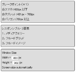
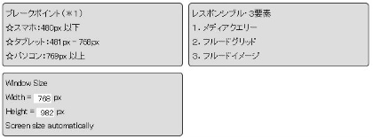
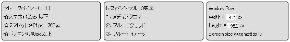
ホームのページ下段にあるテキストのボックス2個とページの画面サイズのモニター(form)の3個をパソコン表示の時、横3列に並べ、タブレット時2個と1個の2行、スマホ時3行に表示させるメディアクエリーの説明です。
ボックスの横配置は、このページでは display:box(or flex) を使わず float を使用しています。
- 3つのボックス、スマホ時上からのHTMLソース
・略・・略・・略・
- 3つのボックスを入れ子にした親ボックス
クラス名:box_3_fl_text_all
- 3つの各ボックス class名:box_3_fl_text
	/* *** HOME3分割ボックス(float) *** */
.box_3_fl_text {
		float:left;
		padding:5px;
		background-color:#ddd;
		border:solid 1px #000000;
		border-radius:5px;}
- メディアクエリー
/* ***** スマホ向けCSS **********  */
@media only screen and (max-width: 480px) {
.box_3_fl_text_all {margin-left:5%;}
.box_3_fl_text     {margin-left:10px;
                   width:85%;}
.second, .third    {margin-top:10px;}
}
/* ***** タブレット向けCSS ******  */
@media only screen and (min-width: 481px) and (max-width:768px) {
.box_3_fl_text_all {margin-left:2%;}
.box_3_fl_text     {margin-left:10px;
                   width:41%;}
.third            {margin-top:10px;}
}
/* *****  パソコン向けCSS ********  */
@media only screen and (min-width: 769px) {
.box_3_fl_text_all {margin-left:5%;}
.first, .second    {width:32%;}
.third             {width:26%;}
.second            {margin-left:10px;
                   margin-right:10px;}
}